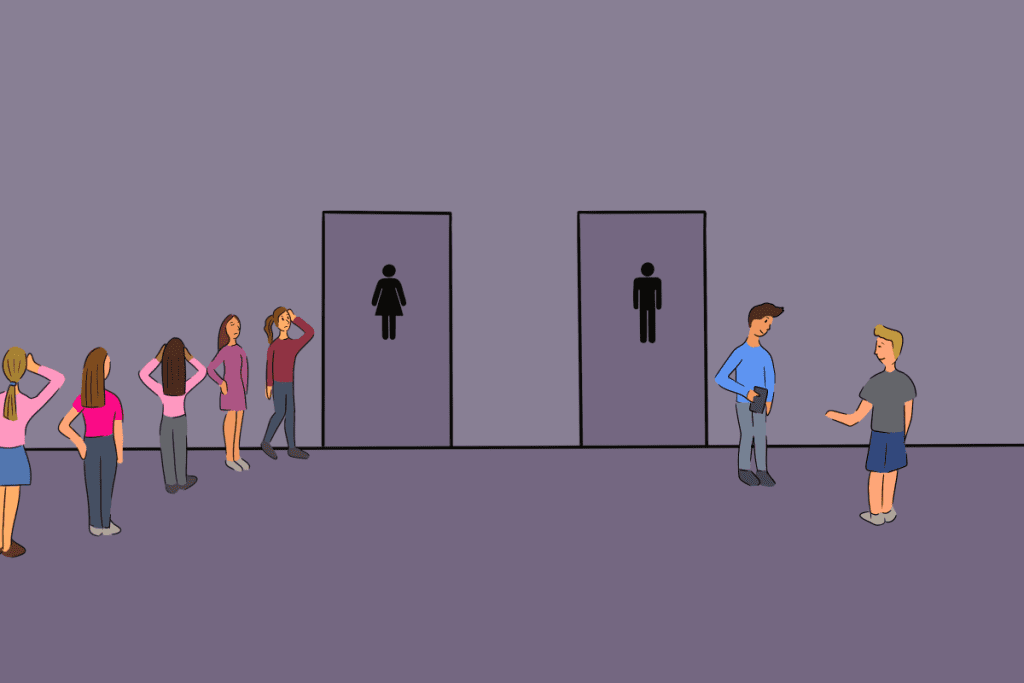
Picture this: you’re standing in a public hallway, urgently needing to use the restroom, but you’re stuck, frozen in place. Why? Because the signs on the doors are so ambiguous that you can’t tell which one is which. Sound familiar? Many of us have been in that situation, and it can be both frustrating and embarrassing.
What could possibly make something as simple as identifying a restroom so complicated? Let’s dive into the nuances of restroom signage, its history, and how a little creativity often leads to confusion instead of clarity.

The Great Restroom Debate: Why Simple Signs Go Awry
Restroom signs have one job: to clearly indicate which facility is designated for men and which is for women. Yet, many public spaces seem to overcomplicate this task, opting for abstract designs, humorous depictions, or cultural stereotypes that leave people scratching their heads.
Why does this happen? It’s often a mix of creativity and a desire to stand out. Businesses and institutions want their signs to reflect the brand’s personality or the venue’s aesthetic. However, the result is often a design so subtle or abstract that it sacrifices functionality for style.
The Psychology of Recognition: What We Look for in Restroom Signs
When you approach a restroom, your brain looks for instant visual cues. Traditionally, these include:
- Symbols or Silhouettes: The universally recognized male and female stick figures.
- Clothing Cues: A dress for women and pants for men, although these are increasingly seen as outdated and limiting.
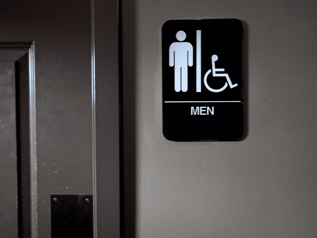
- Text Labels: Clear words like “Men” or “Women” that leave no room for doubt.
However, when signs stray too far from these conventions, confusion sets in. Take, for example, restroom signs that rely on caricatures, cultural references, or artistic flair. While they might be clever, they can be misinterpreted, especially by someone unfamiliar with the local context.
The Modern Challenge: Gender-Neutral Restrooms
In recent years, the conversation around restroom signage has expanded to include inclusivity for all genders. Gender-neutral restrooms are becoming more common, marked by signs that say “All-Gender” or use symbols such as a toilet or a simple figure without traditional gender markers.
This shift is a positive step toward inclusivity, but it can also add another layer of uncertainty for those used to traditional signs. When encountering a restroom with a unique or unfamiliar symbol, people may hesitate, unsure of whether the facility meets their needs.
Real-Life Examples of Confusing Restroom Signs
Let’s take a closer look at some infamous examples of restroom signs that have caused people to pause:
- Overly Artistic Representations
Some restrooms feature abstract art—one figure might have a triangle, and the other a circle. While these shapes might be intended to represent traditional gender symbols, they’re far from intuitive. - Humorous Takes Gone Wrong
Signs that use animals, such as roosters and hens or bucks and does, might seem funny at first. But in a rush, deciphering which animal represents which gender can be unnecessarily stressful. - Ambiguous Silhouettes
Minimalist silhouettes that lack distinguishing features can look nearly identical. If the only difference is the angle of a hat or a slight tilt of a head, it’s no wonder people get confused. - Cultural or Language Barriers
Symbols or words tied to specific cultural norms might not translate well for international visitors, leading to unintended misunderstandings.

Breaking Down the Restroom Sign from the Prompt
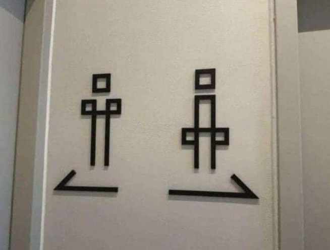
The restroom signs in question left someone standing for 10 minutes, unable to distinguish the men’s restroom from the women’s. Let’s decode the visual cues:
- The Left Figure (Female): Perhaps softer facial features, longer hair, or a traditionally feminine outfit are the intended cues. However, these traits can easily overlap with contemporary male styles or gender-neutral appearances.
- The Right Figure (Male): A shorter hairstyle, stronger jawline, or less adorned outfit might signify masculinity, but again, these distinctions are not always clear-cut.
When restrooms rely on such subtle differences, it’s no surprise that people hesitate. Ambiguity in design, especially in a high-pressure situation like finding a restroom, often leads to frustration.
Designing Better Restroom Signs: Clarity Over Creativity
So, how can we ensure restroom signs serve their purpose without causing confusion? Here are some guidelines for designing effective signage:
1. Use Universally Recognizable Symbols
Stick with the tried-and-true stick figures or unambiguous icons. Even in a creative space, functionality should take precedence over aesthetics.
2. Include Text Labels
Adding simple text like “Men” or “Women” alongside symbols ensures that anyone, regardless of cultural or design familiarity, can easily identify the restroom.
3. Embrace Gender-Neutral Options
For facilities that cater to all genders, use clear, inclusive signs. A toilet icon or the words “Restroom” can suffice without overcomplicating the message.

4. Test Your Design
Before installing signage, test it with a diverse group of people. If even one person hesitates or misinterprets the sign, it’s worth revising.
5. Avoid Stereotypes
Steer clear of outdated gender cues, such as dresses for women and ties for men. These markers can feel exclusionary and don’t reflect the diversity of gender expression today.
The Importance of Restroom Inclusivity
While the confusion over restroom signs might seem trivial, it reflects broader societal challenges around inclusivity and accessibility. For many, particularly those who are non-binary or transgender, navigating public restrooms can be a stressful experience.
By prioritizing clarity and inclusivity in signage, businesses and institutions send a message that everyone is welcome. Small design choices can have a big impact on making spaces more accessible and comfortable for all.
Conclusion: A Small Change with Big Impact
The next time you encounter ambiguous restroom signs, take a moment to appreciate how something so seemingly simple can spark such a complex conversation. Clear and inclusive restroom signage isn’t just about functionality—it’s about respect, accessibility, and creating spaces where everyone feels comfortable.
As we move toward a more inclusive future, let’s ensure our signs point the way forward, not leave people stuck in confusion for 10 minutes. After all, everyone deserves a moment of relief without the added stress of deciphering abstract art.


